


The story behind the creation of HERALBONY's "horse logo" - what we want to say to our fans as we embark on a new journey

We have decided to redesign our logo in order to change the image of disabilities and repaint the perception that they are taken for granted.
A new journey for HERALBONY begins.

Today, together with our fans who have supported us and shared our feelings with us, we look back on the story of the birth of our beloved logo, along with HERALBONY's journey so far.
"HERAL"PONY"?"
The mysterious word "heralbony" frequently appeared in the notebook of Shota, the older brother of Matsuda Takaya and Fuminori, who is four years older than them, when he was in elementary school.

No matter how many times we asked Shota, "What does it mean?", the day when Shota finally told us the answer never came. Then, when Takaya wanted to give meaning to the mysterious word "HERALBONY" that could not be found even by searching, this word became our company name and was born into the world.
But in 2019, things will change.
Just when everyone was about to give up, Shota uttered an unexpected word. When I asked him again what he meant, he blurted out the word "horse!"
After that, although only for a short time, Shota began to tell people around him that HERALBONY was a "horse," and the logo was also designed with a horse motif.

The design was done by Paper Parade . The horse's profile is designed with abstract lines inspired by the image of free-flowing lines drawn on a notebook.
The company name HERALBONY conveys the message, "We want to create new value in the world from things that at first glance seem meaningless."
The secret behind the original HERALBONY font
Not only the logomark, but also the logotype (font) has a story. This is a page from Shota's diary that he wrote every day.

A unique handwriting style that spreads out to fill the entire frame and looks as if it might start moving at any moment. The original HERALBONY font was designed based on the shape of this handwriting, where adjacent letters appear to be connected to each other.


HERALBONY BLUE, always on the side of the logo
 The color of the logo and product packaging is "blue," which is the symbolic color for autism and developmental disorder awareness and represents healing and hope. We have been particular not only about the color but also about the materials used in the packaging to promote the art and life brand "HERALBONY" to the world.
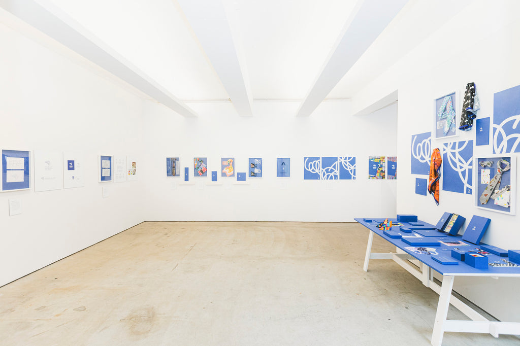
 The package won the A' Design Award & Competition 2022-2023*, one of the world's largest international design competitions held in Milan, Italy in 2023. To commemorate this, the HERALBONY BLUE Exhibition was held at the HERALBONY GALLARY in Iwate in June 2023.
*About the "A' Design Award & Competition 2022-2023" At the world's largest international design competition, "A' Design Award & Competition 2023" held in Milan, Italy, Heralbony's packaging was recognized for its consistent worldview based on the brand concept and won the Silver Design Award in the Packaging Design Award category. ( Click here for details )
 In line with the brand color, the material used for the package design was selected from Japan's more than 9,000 types of paper, "Biotope GA-FS Magellan Blue," which combines a blue hue and a luxurious texture.
The blue color derived from this paper became "HERALBONY BLUE."


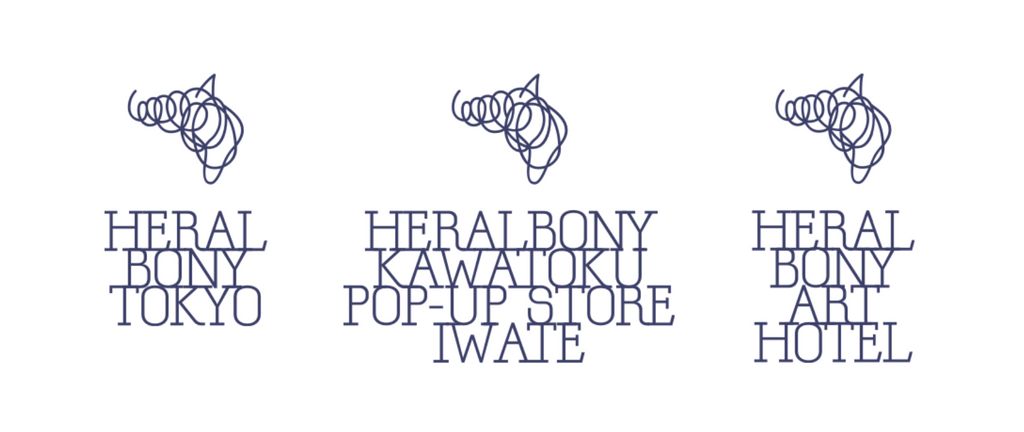
The “PONY” logo is with the pop-up
Let's take a look back at the journey we've walked together with our fans, with some photos of past pop-up stores that featured memorable logos.
When we opened our first store at Shibuya Scramble Square in September 2020, the HERALBONY logo was prominently featured in the key visual at the time.
 Also in September, when the store opened in Nagoya for the first time, the vivid HERALBONY BLUE and “PONY” logo greeted customers at the entrance, creating an even more striking presence.
In March 2021, a pop-up store will open at DiverCity Tokyo, featuring the key visual of "blue" by the unique artist Midori Kudo.


 In July 2022, the 4th anniversary exhibition "The Colours!" will be held. Artworks by 13 artists will be exhibited, providing an opportunity for people to experience the power of unconventional art firsthand.
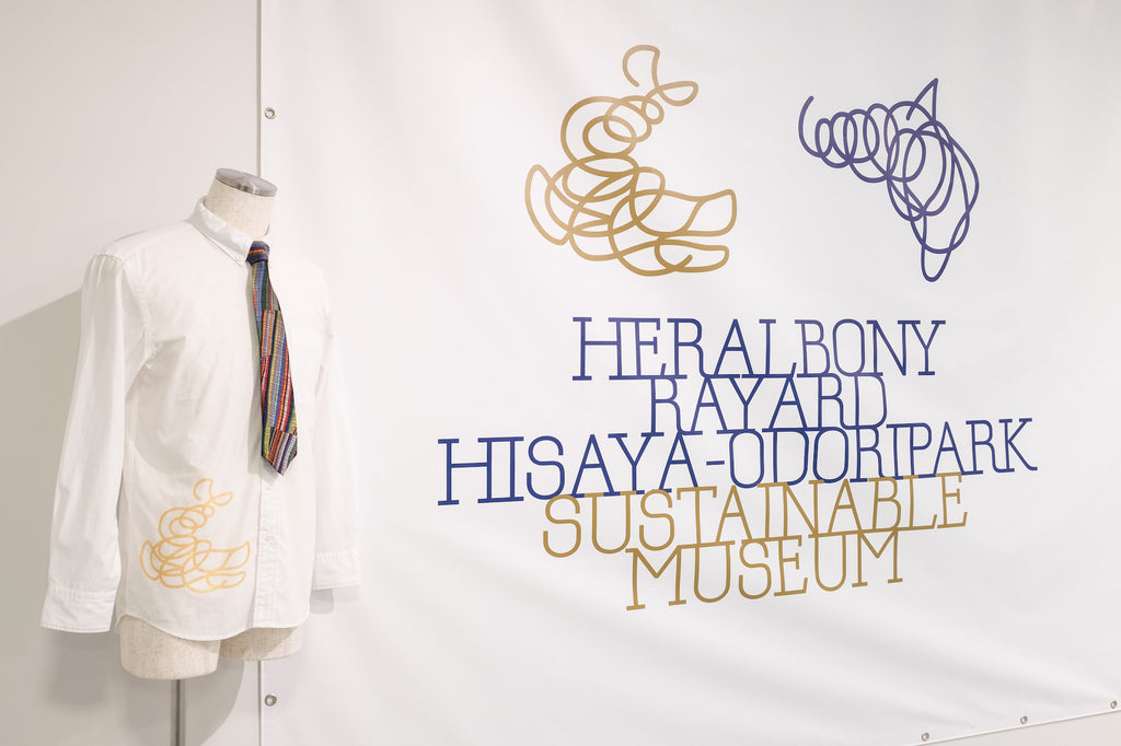
 In March 2023, we held a pop-up in three areas: Tokyo, Osaka, and Iwate, including Shinjuku Takashimaya, with new key visuals.
  In July of the same year, the "Isai no Department Store" was held at Nihonbashi Mitsukoshi, one of Japan's leading large department stores, where artists performed live painting and original artwork was also available for sale.
  From the end of last year to January 2024, a pop-up event focusing on gift items was held at Roppongi Hills with the concept of "Gifts of memorable art - ART IN HEART". During the Christmas season, many gift items and original artworks decorated with unique art were sent off.

A page of history with you. The beginning of a new journey.
 And today, April 23, 2024.
We are saying goodbye to the symbol that has accompanied us until now and starting a new journey across the world.
There is one thing I want to say to all my fans.
We are moving on to the next stage, but we don't want you to feel like it's gone too far out of reach.
We know the loneliness of letting go of something important. But we choose to change because we need to be the medium to generate overwhelming admiration and respect for "uniqueness."
It is my sincere hope that as many unique individuals as possible will blossom in this world, and that the negative image associated with the word "disability" will be dispelled.
I hope you will continue to walk with us.
I hope that sometimes we will join together in fighting against the preconceived notions, common sense, and unreasonable society that divides this world.
I hope that together we will be excited by the possibilities of uniqueness.
From a "welfare experimental company" to a "cultural enterprise" that will continue for the next 100 years.
In order to become a cultural company that will continue for 100 years to come, we at HERALBONY promise to continue to be honest and humble, to provide high-quality products and services that please our customers, and to strive to be a presence that surprises and inspires them.
Let today be the first page of an important history.
We would appreciate your support for HERALBONY on its new journey.
A journey with you. Last PONY Presentation

We want to deliver this "PONY" logo product, which is where we began, to the very last one. With that in mind, we are currently holding "The Last PONY Presentation."
As an expression of gratitude to everyone who has supported HERALBONY and shared our thoughts with us, we are offering up to 50% off on products bearing the old HERALBONY logo (with a horse motif).
We are not reproducing products with the old logo, so once they are sold out, they will be gone. We will deliver to you all the last of the old logo products that we love.
>Click here for a list of eligible products


